News
DigitalChefs by NTGAS: When Gastronomic Innovation Becomes a Brand with an Identity of Its Own
- 09/11/2026
- What I like
It has been a while since I last shared new stories on ElefantAmbulant. Certainly not because of a lack of projects. Sometimes, everyday responsibilities, new challenges, and professional commitments make you postpone something you particularly enjoy: stopping for a moment, looking back, and telling the stories behind some of the brands you have had the privilege of creating.
And what better way to return to this little tradition than with a brand that is especially close to my heart and has also given me tremendous creative possibilities: DigitalChefs by NTGAS.
A brand born from innovation, knowledge accumulated over the years, and an idea that, at the time, seemed as ambitious as it was exciting: digitizing flame control to automate and standardize the cooking of recipes, particularly rice dishes, in professional kitchens.
But it was also a brand that presented me with an interesting challenge: how could we give a new technological project its own personality without losing its connection to such an established company as NTGAS?
My involvement with DigitalChefs, moreover, has gone far beyond developing its brand and communications. I have had the opportunity to actively participate in the design of the product itself, both in aspects of its hardware and in the design of its digital interfaces: the mobile application and the equipment's control screens. This has been particularly interesting work because it allows me to approach design from a much broader perspective, where aesthetics, ergonomics, user experience, and functionality must work together. When you participate in creating a product's identity and also in designing how people interact with it, the brand stops being merely something you see and becomes something you experience. And that relationship between industrial design, technology, usability, and communication is precisely one of the aspects I have enjoyed most about DigitalChefs.
When Innovation Needs Its Own Identity
When the NTGAS team began developing what we now know as DigitalChefs, it was clear that we were dealing with much more than a simple evolution of the professional gas burners NTGAS had been manufacturing for years.
There was something more.
The experience accumulated in designing and manufacturing gas burners was now being combined with technology, electronics, software, and automation to provide a solution to one of the greatest challenges in professional foodservice: ensuring that a recipe can be reproduced using the same cooking parameters, regardless of who is working in the kitchen.
And we are talking about rice dishes, where even a small variation in flame intensity or cooking time can significantly affect the final result.
The new programmable burners made it possible to digitally control the different cooking stages and reproduce recipes previously defined by a professional chef.
An innovation of this kind needed much more than a commercial name. It needed a recognizable brand capable of conveying technology, innovation, ease of use, and, above all, trust.
A brand that could coexist with NTGAS while developing a personality of its own.
And that is how DigitalChefs by NTGAS was born.
A New Brand with NTGAS DNA
In previous ElefantAmbulant articles, I have explained how I approached the redesign of the NTGAS brand and why I decided to preserve the elements that formed part of its original identity.
That experience proved particularly valuable when developing DigitalChefs.
We had something very important working in our favor: a recognizable corporate identity and an established visual language that already worked.
There was no reason to abandon that visual heritage. On the contrary, we needed to use it to establish an immediate connection between the two brands. That is why, from the very beginning, I knew there were two elements that had to maintain this link: the distinctive blue geometric symbol and the typographic identity associated with NTGAS.
The corporate blue would act as a connecting element, while the presence of the parent brand would clearly identify the project's industrial and technological origins.
But we needed to introduce something new, something that spoke of digitalization, something that explained, almost at a glance, that we were looking at a new way of working.
And that was when the idea emerged that would eventually become the brand's most recognizable element.
The Symbol: When a Click Sets Innovation in Motion
One of the most interesting elements of DigitalChefs' visual identity is its symbol.
We started with the blue geometry that was already part of NTGAS' corporate visual identity. Its slanted shape conveys dynamism and direction, two qualities that perfectly suited the innovative nature of the new project.
But this time, the symbol needed to tell a bigger story.
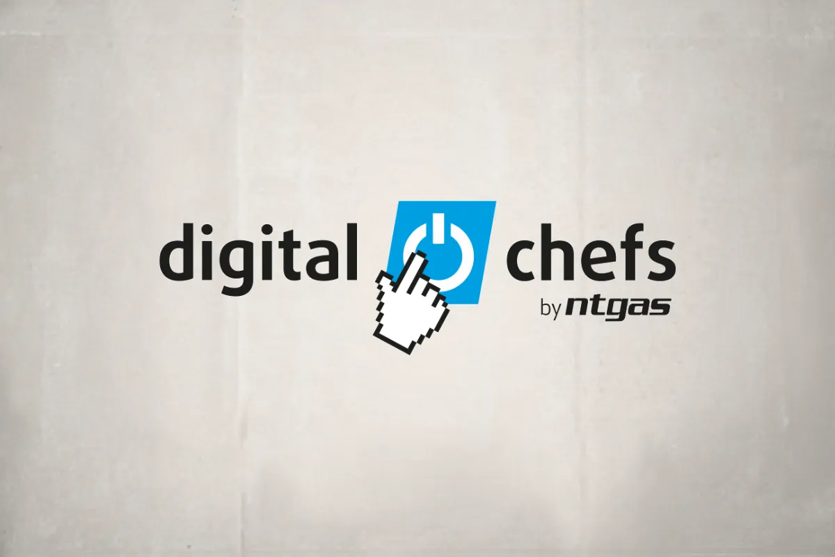
Inside it, I incorporated the familiar universal power symbol, represented by an open circle intersected by a vertical line. It is an extraordinarily simple and recognizable graphic element. A symbol we constantly encounter on electronic devices and immediately associate with technology, control, and starting up a system.
However, something was still missing.
I wanted to introduce an element that would reinforce the digital concept while adding personality, freshness, and a certain sense of visual playfulness.
And then came the hand-shaped cursor, with its distinctive pixelated appearance reminiscent of the earliest graphical computer interfaces. A small nod to the history of computing which, combined with the power button, creates a highly expressive image. The hand seems ready to activate the system. One click, and a new way of cooking begins.
I particularly like this graphic solution because it communicates a technological concept without needing to resort to electronic circuits, microchips, or overly complex illustrations.
Innovation does not always require a complicated visual language. Sometimes, the simpler the idea, the greater its power to communicate.
The result is a recognizable, dynamic symbol with a personality of its own, preserving the visual connection with NTGAS while bringing a distinctive element to the new project.
DigitalChefs: Technology, Gastronomy, and Typography with Character
The name DigitalChefs expresses the project's philosophy quite clearly. On the one hand, Digital, which introduces us to the world of technology, programming, and automation. On the other, Chefs, which brings us back to cooking, gastronomy, and, most importantly, professional expertise.
Because there is something I have always considered fundamental to this project: DigitalChefs does not aim to replace a chef's talent, but rather to enable their knowledge to be reproduced with precision.
It is the professional chef who defines a recipe, its ingredients, proportions, and cooking times. Technology takes care of executing the programmed cooking stages. This relationship between gastronomic expertise and technological precision also needed to be reflected in the typography.
That is why I opted for clean, contemporary sans-serif lettering, with a strong visual presence and immediate readability. The use of lowercase letters in digitalchefs gives the brand an approachable, modern, and accessible character, moving it away from an excessively industrial image.
In contrast, the by NTGAS signature clearly establishes its origins, recovering the typographic character of the parent company.
This approach responds to a very specific brand architecture strategy: developing a distinctive identity supported by NTGAS' reputation, experience, and industrial capabilities.
DigitalChefs has its own name and personality, but never loses sight of where it comes from.
Three Compositions for a Versatile Brand
One of the aspects I value most when developing a corporate identity is its ability to adapt. A brand may work perfectly on a computer screen but encounter difficulties when applied to a product, a label, a catalog, or the signage of an exhibition stand.
And with DigitalChefs, this was particularly important. That is why I developed different brand compositions. The first places the symbol on the left and the name digitalchefs on a single line, with the by NTGAS signature positioned in the lower right-hand area. A balanced horizontal solution, especially useful for headers, digital media, and applications where more width is available.
The second organizes the name on two levels, digital and chefs, keeping the symbol on the left. This compact arrangement is particularly effective in applications where we need to achieve greater visual presence without occupying too much horizontal space.
And the third introduces a composition that I personally like very much: the symbol sits between the words digital and chefs, acting as a connecting element. A dynamic solution that visually reinforces the relationship between both concepts: technology and gastronomy.
Three ways of presenting the same identity, preserving its essential elements while making it easier to adapt to different needs.
That is one of the greatest advantages of developing a brand as a system rather than as a rigid, unchangeable image.
Corporate Blue: Continuity, Trust, and Innovation
Choosing the color was, in this case, much easier than in other projects. Blue was already part of NTGAS' personality, and it made sense to retain it as DigitalChefs' primary corporate color. In this context, blue can be associated with technology, precision, trust, and professionalism. It also creates a highly effective visual contrast with the black typography and the white power symbol and cursor.
The overall design conveys cleanliness, modernity, and a technical character that perfectly suits the product. But, above all, it maintains an immediate connection with the parent brand.
This is particularly important when a company begins to diversify its activity through new product lines or new commercial brands.
It is not about making them all look the same, but about establishing a recognizable relationship between them.
Visual consistency makes it possible to build a family of brands in which each has its own personality, while all share a common origin and values.
DigitalChefs: From Visual Identity to Programmable Gas Burners
The true meaning of a brand emerges when it connects with the product it represents. In this case, DigitalChefs is backed by a very specific technology developed by NTGAS for professional kitchens.
The eHQ04 and eP31 automatic burners make it possible to program different cooking stages through an application, controlling both timing and flame intensity. The aim is to standardize results, facilitate recipe reproduction, and optimize work in professional kitchens. This solution is particularly valuable for restaurants specializing in rice dishes, businesses with different kitchen teams, and establishments that need to maintain consistent quality across their gastronomic offerings.
From a communication perspective, this gave us an extremely powerful message. We were not simply selling a burner; we were communicating a new way of organizing food production, making better use of resources, and transforming a chef's knowledge into reproducible cooking processes.
And that idea needed to be reflected in every communication element.
The brand had to work on the equipment itself, in catalogs, demonstrations, professional trade shows, videos, websites, and social media. That is why the digital symbol and typographic treatment have proved particularly useful in developing commercial and advertising materials that maintain a recognizable personality.
An identity that has allowed me to explore, from a graphic perspective, concepts such as digitalization, control, technology, precision, and the future of professional cooking.
When Innovation Begins to Receive Recognition
One of the most rewarding aspects of DigitalChefs has been seeing how a project that began as a technological commitment has gradually earned recognition from organizations and professionals across the industry.
And there have been quite a few.
In 2024, the DigitalChefs eHQ04 and eP31 programmable burners received the 1st GUEXT Award for Excellence in Hospitality Innovation, one of the project's first major recognitions.
That same year, DigitalChefs was a finalist in the Hot Concepts Awards, in the Machine of the Year category.
Also in 2024, NTGAS was selected as a finalist in the National Connected Industry 4.0 Awards, organized by Spain's Ministry of Industry and Tourism, in recognition of its commitment to industrial digitalization and the DigitalChefs project.
These achievements were joined by the FAES 2024 Innovation Award, presented in 2025, which held particular emotional significance because it came from the business community of our region.
And in 2025 came another very important recognition: the FEMEVAL Innovation Award, presented to NTGAS for its commitment to technological solutions for professional kitchens, including DigitalChefs.
When you have spent so many years working alongside David, Héctor, and the entire NTGAS team, these awards feel especially meaningful, because you know just how much work lies behind every development, every test, every improvement, and every new product.
And because you also see how the identity you once designed to accompany an innovation eventually becomes part of an increasingly important business story.
A Brand That Keeps Growing and Offering Creative Possibilities
Since we first began working on DigitalChefs, the project has evolved considerably, and so have its communication needs.
New products, new applications, commercial materials, digital content, professional demonstrations, trade shows, and marketing activities have all required the identity to adapt to different contexts.
And that is precisely where I most appreciate the decisions I made during its design. The visual connection with NTGAS continues to work. The symbol retains its ability to convey technology and dynamism. And the different compositions make it possible to meet graphic design needs without losing brand recognition.
Because a well-designed brand should not respond only to the moment in which it was created.
It must be prepared to evolve, grow, and accompany the company for many years.
That is one of the great objectives of corporate identity: ensuring that today's graphic design decisions will still make sense tomorrow.
Much More Than a Brand
DigitalChefs is one of those projects that allows me to particularly enjoy my work, because of its technological component, the creative challenge involved in developing its identity, and the opportunity to contribute to the communication of an innovation that is bringing NTGAS' industrial expertise into new applications within professional gastronomy.
But above all, because behind this brand are people with whom I have spent many years sharing projects, challenges, ideas, achievements, and a very similar way of approaching our work.
Thank you to David and Héctor Pardo for continuing to trust my experience, for allowing me to participate in the development and communication of DigitalChefs, and for giving me the opportunity to be part of a project that continues to grow.
And thank you also to the entire NTGAS team, because a brand may be designed in a studio, but its true value is built every day through the work of the people who make it possible.
At ElefantAmbulant, I will continue sharing stories like this, where design, strategy, and communication are put at the service of real projects.
Because, ultimately, creating a brand is not simply about giving an idea a visual identity. It is about giving it an identity capable of accompanying it as it becomes a reality.
And with DigitalChefs, that reality began with something as simple as a click.
Tito Estruch
Interim Communication Manager | Expert in Marketing and Brand Creation