
News
PINEDISA: How We Created an Elegant Corporate Identity for a Holding Company with Gold, Black, and a Strong, Memorable Name
- 05/03/2026
- What I like
Some brands are built with method, and others are built, additionally, with an extra dose of affection. PINEDISA belongs to that second group. Not only because this project was created for a much-loved family member—someone who has valued my work for years and kept pushing me to grow—but because behind this identity there was a very clear idea: to build a brand with presence, elegance, and a long-term vision, worthy of a company created to operate as a holding company / holding structure.
At ElefantAmbulant, I usually tell the “what” of a brand, but what interests me most is the “why.” And with PINEDISA, that “why” is written in uppercase: we’re talking about a company whose purpose is to participate in the capital of resident and non-resident entities, and to acquire and dispose of shareholdings and securities… In other words: structure, control, strategy, permanence. All of that had to be felt in the brand without needing to explain it in paragraphs.
When the surname pulls the thread
In most of the brands I’ve developed for my dear Edu, the surname has been the common thread. Why? Because it has something you can’t fake: strength, sonority, brevity, and memorability. A surname with character works like an anchor: it lets you build a sober, coherent, and trustworthy universe around it.
In this case, the solution was to bet on a name that sounds corporate and solid: PINEDISA. A name that, beyond condensing identity and belonging, has rhythm, is easy to pronounce, and behaves well in formal contexts: digital signatures, corporate documentation, signage, stationery, a corporate website, or even a simple business card (which, in this kind of business, is a key piece). In the sketches, for example, the CEO’s corporate card appears with the domain and associated email, reinforcing that business and professional vocation from the very first touchpoint.
Corporate identity for a holding: less noise, more judgment
If there’s something important about a brand of this profile, it’s understanding that it doesn’t need to “shout” to impose itself. A holding company doesn’t sell impulse; it sells security. And security is communicated through design decisions that may seem small, but they sustain perception:
-
Clear hierarchy
-
Authoritative typography
-
Symbolic color
-
Clean composition
-
An applicable system (not just a pretty logo)
Here the goal wasn’t to “decorate” a company, but to provide it with a stable visual framework that stands the test of time and works across any medium: from a corporate PDF to a minimalist website, from a portfolio of investees to an investment deck.
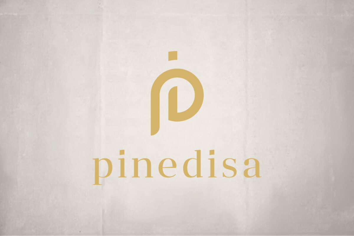
Gold and black: a code of value
In PINEDISA, the color choice was a strategic decision, not an aesthetic one. We chose gold and black for a simple reason: together they build a universal language of value, excellence, and control.
-
Black brings sobriety, authority, seriousness, and focus. It’s the color of “nothing is extra.” It works especially well in corporate environments because it conveys stability and doesn’t go out of date.
-
Gold adds the necessary nuance: prestige, a wealth-minded vision, sustained success, and a certain idea of a “premium brand” without going over the top.
The key is balance: gold shouldn’t become a gratuitous “luxury” effect, but a controlled accent that elevates the brand. In this kind of identity, less is more: gold is used as a signature, not as makeup.
Typography: refined, elegant personality with craft
The logotype typography was developed in search of a very specific quality: personality without extravagance. It had to be refined and elegant, yes—but it also needed to communicate something harder to achieve: judgment.
When you design for a professional firm or a holding company, typography has to hold three things at once:
-
Legibility (digital and print)
-
Character (so it doesn’t look like a template)
-
Timelessness (so it doesn’t look “trendy” in two years)
That’s why a refined, elegant typeface works so well when combined with an orderly composition and a strong color like black. The result is a brand that feels serene and “well positioned,” as if it had always been there.
Composition: elegance is in the air
A solid corporate brand usually has one thing in common: it knows how to leave space. Composition (margins, breathing room, proportions) is an invisible message: it conveys order, method, and clarity. In PINEDISA, that cleanliness was essential for the whole to be perceived as:
-
institutional, but not rigid
-
premium, but not ostentatious
-
contemporary, but not fleeting
In businesses where the document, the contract, and the presentation carry weight, the brand must behave like a seal: discreet, impeccable, trustworthy.
A brand designed to grow with the ecosystem
This project doesn’t live in isolation. Just like other assignments for the family, PINEDISA is part of a connected ecosystem of work: websites, catalogs, corporate materials… That’s why, even though we’re talking here about the logotype and identity, the real value is that the brand was designed to become a tool. A tool that simplifies decisions, unifies criteria, and enables consistent corporate communication.
And in practice, that means something very concrete: when tomorrow it’s time to design a presentation template, an investment deck, or a website, you won’t start from scratch. You’ll follow a system.
Thank you for letting me sign a brand with so much meaning
Some projects are remembered for their complexity; others, for their symbolism. PINEDISA stays with me for both reasons, but above all for the personal side. Thank you for the trust, for valuing my work for years, and for allowing me to create a new brand with its own identity—elegant and built to last.
Because in the end, that’s what ElefantAmbulant is about: turning vision into form, and form into brand.
Tito Estruch
Interim Manager in Communication | Expert in Marketing and Brand Creation