
News
A Corporate Identity with Heritage, Precision, and a Style of Its Own: ESTRUCH Abogados in Gandia
- 10/02/2026
- What I like
Talking about ElefantAmbulant is talking about those projects that, for one reason or another, hit closer to home. And not only because they involve strategy, design, and craft, but because they carry an emotional weight that’s hard to separate from the process. ESTRUCH abogados was one of those assignments: not every day do you get the chance to create a brand with your own surname.
The request came from my friend and namesake Vicent R. Estruch, a lawyer with an established track record and prestige, who wanted to shape the identity of his firm in Gandia. And the premise was clear: to build a brand that conveyed strength, calm, and credibility, without falling into the legal sector’s book of clichés.
Because the world of legal branding is full of common tropes: classic columns, scales, gavels, laurels, easy gold… elements that “work” by repetition, but rarely build a true identity. Here, the challenge was different: to escape the noise and project authority through simplicity, giving the firm an image with “heritage”—that sense of tradition and permanence—without looking dated.
An intelligent symbol: E^A, the precision of what matters
The starting point for ESTRUCH abogados is its symbol. At first glance, it’s minimalist; on second look, it’s brilliant: a bold, present E, paired with an A placed in an elevated position, almost like a superscript. The result inevitably evokes a mathematical element: E^A.
And that small nod is more important than it seems.
In a law firm, trust is built through precision, method, and mental clarity. The superscript isn’t decoration: it’s a conceptual statement. It points to the idea of structure, argumentation, and applied logic. In the same way a formula doesn’t allow improvisation, neither does a solid legal strategy. That typographic gesture—subtle yet powerful—adds freshness without breaking the sober tone the sector demands.
What’s more, the symbol works as a contemporary monogram: it’s memorable, reproducible, and highly usable in real-world contexts (email signature, favicon, stamp, stationery, social media, signage). A well-designed brand isn’t measured only by how good it looks “large,” but by how well it holds up day to day.
Typography with character: tradition, balance, and hierarchy
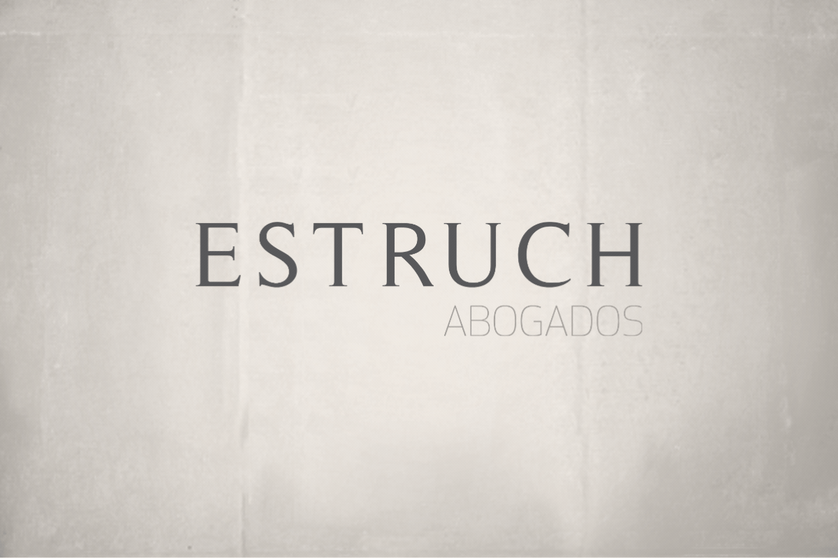
Typography is the second major pillar of this identity. In the primary logotype, ESTRUCH appears in uppercase serif letters, with generous spacing that lets the name breathe. That tracking creates an immediate sense of calm and control. Nothing shouts, nothing competes: everything falls into place.
Serifs, when chosen well, are a classic resource in legal branding for a reason: they convey culture, craft, and lastingness. But the key here isn’t “using a serif,” it’s choosing one with the right degree of contemporaneity: clean, elegant, with balanced proportions. The result: heritage without rigidity.
In contrast, ABOGADOS appears with a lower, more discreet hierarchy—almost like an institutional whisper. That decision is strategic: the surname leads (personal brand and reputation), and the profession supports (service clarity). It’s the kind of structure that works well for local positioning: when someone searches for “lawyer in Gandia,” they’re not just looking for a service; they’re looking for a name they can trust.
Color: sobriety that inspires trust
The chosen palette sits in a range of anthracite gray on white. There’s no artifice here—and that’s the strength.
In corporate identity, color doesn’t just decorate: it sets the tone. In the legal sector, too much color often undermines seriousness. Dark gray has a quality that fits perfectly with a firm with heritage: it communicates serenity, neutrality, balance and, above all, trust. It doesn’t try to persuade through impact; it persuades through stability.
And that approach is consistent with the whole: a brand that doesn’t need to raise its voice to be heard.
Composition: when empty space also communicates
If I had to sum up this identity in one word, it would be: respect. Respect for the craft, for the client, for time. And that translates into composition.
The symbol has air. The logotype breathes. There’s no saturation or competing elements. White space is a premium resource, and in a law firm it works as a non-verbal message: “There is order here. There is judgment here. There is no improvisation here.”
That compositional cleanliness reinforces the idea of an established firm: a place where form and substance are aligned.
Identity for a law firm in Gandia
Beyond design, the objective was clear: to create a brand capable of sustaining strong communication over time. An identity that would work across corporate stationery, the exterior plaque, the digital signature, legal documentation, presentations, and any future touchpoint the firm might need.
Because a professional services brand—especially a legal one—must be consistent. In this case, coherence isn’t aesthetic: it’s reputation.
I’ll close with a very special thank you to Vicent R. Estruch for his trust and for allowing me to build the brand and corporate identity of his firm. It was an exciting project professionally, and even more so personally. Creating a brand with your own surname is a privilege… but creating it for a friend—and doing it with meaning—is the kind of work that stays with you.
At ElefantAmbulant I’ll keep sharing these kinds of processes: brands that don’t just aim to look good, but to be—with clarity, strategy, and character.
Tito Estruch
Interim Manager in Communication | Expert in Marketing and Brand Creation