
News
ANGELS fon: How We Designed a Hearing Aid Brand That’s Friendly, Consistent, and Ready to Grow
- 19/12/2025
- What I like
Talking about ElefantAmbulant means talking about brands born from clear ideas and real needs. It means talking about projects that go beyond design — they seek meaning, structure, and direction. And if there’s one brand that perfectly embodies this approach, it’s ANGELS fon, the hearing care proposal from the ANGELS vision Group.
A Clear Need: Making Quality Hearing Accessible
ANGELS fon, like many great brands, was born from a sharp observation of the market. Arturo Torró, with his strategic vision and business instinct, spotted a clear opportunity: many people needed hearing solutions, but most options available were tied to high prices, cold experiences, and impersonal brands.
With that insight, he jumped in headfirst to create a brand that would combine technical quality, personalized service, and competitive pricing. The result was ANGELS fon — a brand with a clear mission: to be approachable, efficient, and built for sustainable growth.
And just like what happened with ANGELS optics, the time came to bring order, structure, and standardization to a visual identity born in the heat of action. A brand that needed coherence and direction to continue growing without losing its essence.
The First Step: Gathering Materials and Spotting Visual Disconnects
The process began with gathering everything created so far: signage, flyers, social media content, uniforms, storefront designs, displays, and more. Like in many expanding projects, I found elements that were functionally well resolved but lacked visual unity. There was no clear aesthetic line. The red color varied, the logo appeared in different versions, and typography changed depending on the designer or provider involved.
Yes, there was a recognizable identity — but it was fragile. Easily distorted. And in a brand poised for growth, that’s a vulnerability.
The Brand Manual: A Starting Point for Meaningful Growth
With all the materials and insights collected, and after conversations with the ANGELS vision team, we developed the ANGELS fon corporate identity manual. Like in all well-structured projects, it became the brand’s visual cornerstone — a guide to ensure that everyone involved, from designers to commercial teams, had a common reference point.
In this case, the decision to follow the group's visual line helped streamline the process.
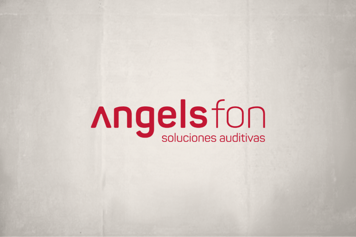
The Logo
The brand’s logo is composed of two different font weights, creating a layered reading experience. The “A” without the crossbar remains a recognizable symbol of the group, paired with a clean, modern, rational font — communicating professionalism, technology, and precision.
We defined versions for horizontal and vertical formats, with and without the claim, in monochrome, reversed, etc. Any brand aiming to scale needs this kind of versatility from the outset.
The Color
ANGELS fon uses a strong, intense red as its primary color — Pantone 200 C. A tone associated with energy, action, confidence, and personality.
The manual clearly defines its use across different opacities and backgrounds, as well as combinations with white and black. This ensures that whether in print or on screen, the brand always expresses its essence.
Typography
The corporate typography is Panton for the logo and Grota Sans (Book, Regular, Medium, and Bold) for visual development. These are modern, legible, and highly adaptable font families that work across both technical designs and more emotional advertising materials.
Real-World Applications: From Storefronts to Brand Experience
A brand doesn’t live inside a manual. It lives in everyday reality. That’s why part of the work involved defining practical use cases across key touchpoints:
-
Storefronts and signs: applied using white composite material on a red background (NCS S 7020-R80B), with defined thicknesses and proportions.
-
Vinyl graphics: industrial-style faux window frames, use of hearing aid iconography, key messages like “Free 30-Day Trial.”
-
Interior design: white lacquered wood cubes, typography on walls, informative TV screens.
-
Stationery and merchandising: business cards, folders, bags, price tags, towels, mugs...
Each of these elements is documented in the manual with measurements, use cases, and visual examples. Because branding isn’t about looks — it’s a tool to create coherence, recognition, and trust.
Strategic Branding: Designing for Others to Execute
One of the most important aspects of this project was designing with the understanding that others would be implementing it. When you do branding for a growing business group, you’re not designing for yourself. You’re designing for dozens of people down the line: sign-makers, printers, community managers, interior designers, sales teams...
That’s why the ANGELS fon manual isn’t just a technical document. It’s a working tool — clear, visual, and accessible. It’s built to prevent mistakes, support decision-making, and preserve the brand’s essence.
A Well-Deserved Acknowledgment
ANGELS fon wouldn’t exist without the brave vision of Arturo Torró, who once again saw a need and wasn’t afraid to act on it. His entrepreneurial spirit remains a powerful source of inspiration.
I also want to thank Ician, now responsible for the brand, for continuing to trust my work and giving continuity to everything we built.
Tito Estruch
Interim Communication Manager | Expert in Marketing and Brand Creation