
News
The REFERENCE Studio: Creating a Premium Brand for a Beauty Salon in Dénia
- 27/02/2025
- What I like
Great projects are born from well-defined dreams and, above all, the determination to make them a reality. When Ferran Ferrer told me he was in negotiations to take over a premium beauty salon in Dénia, I was genuinely happy for him. I knew he had been pursuing this goal for years, waiting for the right moment to turn his passion into a benchmark in the La Marina Alta region.
Our professional relationship had already come a long way. Over the years, I had worked with Ferran on various branding and corporate identity initiatives for other hairdressing projects. That mutual trust was key when he asked me to take charge of creating the image for his new salon. I knew this wasn’t just another salon—it was the project he had been dreaming of for years, and it had to reflect elegance, exclusivity, and leadership.
The Starting Point: Becoming a Reference
Before starting any branding work, I like to gather firsthand information, review ideas, and revisit concepts that have emerged in previous conversations. So, I went back to the notes from our long work sessions at his home, revisiting every detail of his concerns and business vision. And there was one concept Ferran kept repeating:
“I want my salon to be the reference in Dénia and La Marina Alta.”
That message wasn’t just a passing remark; it was the central pillar upon which the brand had to be built. Ferran’s ambition wasn’t just to open another beauty salon; he wanted to set a new standard of quality in the area, attract a discerning clientele, and stand out from the competition with a premium offering.
The Naming: When Words Define an Identity
In my experience, the process of creating a brand name is more complex than graphic development. Finding a name that encapsulates a concept, is memorable, and is legally and digitally viable is a significant challenge.
Inspired by Ferran’s ambition and his desire to be a point of reference in the industry, a name emerged that summed it all up in a single word: REFERENCE.
I knew we had found the perfect idea. But before presenting it, I conducted a thorough feasibility check:
- Trademark registration to ensure it was unique and legally protected.
- Domain availability, essential for digital identity.
- Social media profiles, making sure we could build a strong community without conflicts with other names.
After verifying all these aspects, the brand was presented as The REFERENCE Studio, further elevating its exclusive and high-end character.
Presenting the Brand
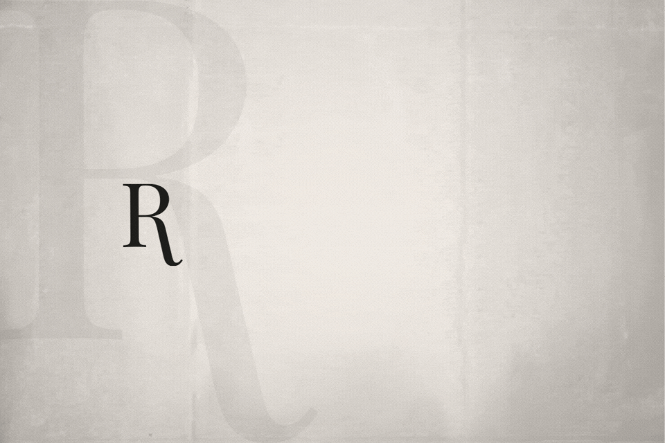
When the time came to present the concept to Ferran and his wife, Mariam, I knew that the naming had to be accompanied by a visual identity that matched its level. I wanted something clean, timeless, and sophisticated. I opted for a monochromatic image, based on the purity of black and white, which would convey elegance, professionalism, and modernity.
I remember the moment I showed them the concept perfectly. Their faces said it all before they even spoke. They loved the idea, the development, and, most importantly, the coherence between what they wanted and what the brand represented.
Building a Space That Reflects the Brand
The next step was to materialize that image within the salon itself. The brand experience had to go beyond the logo and communication—it needed to be reflected in the architecture and interior design of the studio.
Ferran asked me to find an interior design professional who could transform the space into something that truly reflected the essence of The REFERENCE Studio. I had no doubts: I reached out to Xavier Pastor, one of the best professionals in the field.
From the very beginning, Xavier understood the project’s potential and worked on a proposal where the brand, design, and customer experience were in perfect harmony. The result was a space where every detail was designed to reinforce the brand’s premium perception: minimalism, high-quality materials, refined lighting, and a layout that enhanced comfort and exclusivity.
A Black and White Communication Strategy
The The REFERENCE Studio brand not only had to be reflected in the physical space but also in how it communicated with its audience.
- Photography: We opted for clean and simple images to convey the premium and distinctive essence of the salon.
- Social Media: A strategy based on visual elegance was designed, showcasing Ferran’s work with a cinematic style.
- Printed Materials and Physical Branding: Business cards, catalogs, and packaging were designed with a clean and sophisticated aesthetic.
All these elements ensured that every touchpoint with the brand offered a cohesive and aligned experience with the identity of The REFERENCE Studio.
A Project That Leaves a Mark
I couldn’t be more grateful to Ferran for trusting me once again. This has been one of the projects I am most proud of—not just because of the final result, but because of what it represents.
The REFERENCE Studio is not just a premium beauty salon. It is the realization of years of effort, learning, and evolution. It is a place where aesthetics and well-being meet exclusivity, where every client experiences what it truly means to be attended by a reference in the industry.
Creating the identity of The REFERENCE Studio was an exciting journey. From the initial concept to its implementation in every detail, it was a testament to how strategy and creativity can shape a brand with soul and purpose.
This project reaffirmed my belief in the importance of building brands with a solid foundation—brands that not only look good but have real meaning.
In future posts on ElefantAmbulant, I’ll share more about other projects with Ferran and how we have continued collaborating to build his brand universe.
If you have a project in mind and need help defining its identity, I’d be happy to help you create a brand that leaves a lasting impact.
Until the next post.
Tito Estruch
Interim Manager in Communication | Marketing & Brand Creation Expert