
News
COVALTIC: A Fresh and Elegant Image for a Company of the Future
- 12/02/2025
- What I like
Designing a company’s visual identity is always a challenge, but when it comes to a young company with strong values and a clear vision for the future, the challenge becomes a unique opportunity to create something that truly resonates with its essence and stands the test of time. This was the case with COVALTIC, a company specialized in Data Protection, legal advice in e-commerce, and trademark registration.
COVALTIC is not just a company that offers technical and legal services; it’s a firm that understands the importance of protecting information in today’s digital world while providing innovative solutions to its clients. From the very beginning, I knew that the brand had to reflect this combination of professional seriousness and youthful dynamism.
The Challenge: Creating an Identity that Balances Professionalism and Modernity
The first step was to thoroughly understand COVALTIC’s values and mission. Despite being a young company, COVALTIC had a solid foundation of principles: transparency, innovation, and commitment to digital security. However, they also wanted to stand out in a sector that often feels cold and distant.
The challenge was clear: to create a visual identity that communicates professionalism without losing freshness. I wanted the brand to reflect the seriousness required by the legal and data protection fields, but also to convey the energy and vitality of a company in constant evolution.
The Choice of Colors: A Dialogue Between Formality and Vibrancy
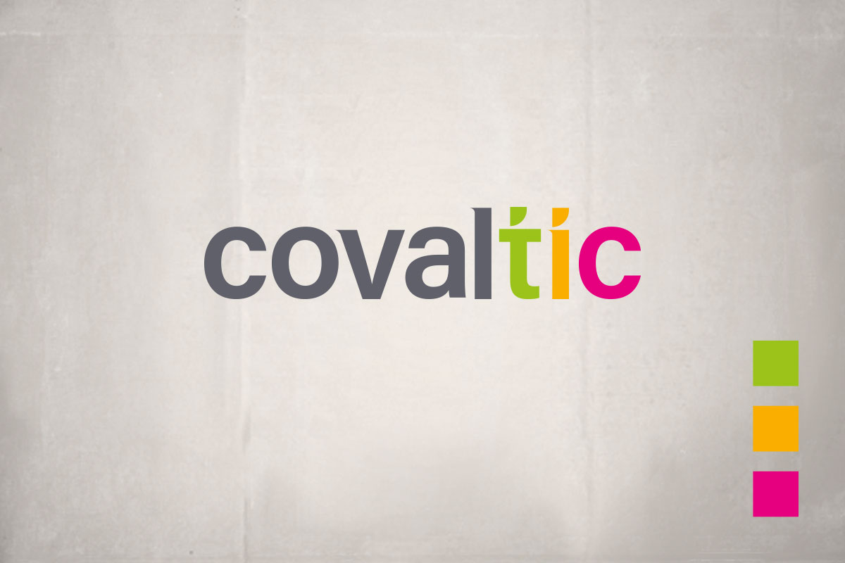
To achieve this balance, I opted to combine an elegant, sober gray with three vibrant colors: lime green, egg yolk yellow, and magenta. Each of these colors was carefully chosen to represent the company’s different departments:
-
Lime green: Represents the Data Protection area. This color is associated with security, trust, and growth—key aspects in managing personal and business information.
-
Egg yolk yellow: Identifies the legal advice in e-commerce department. Yellow conveys clarity and precision, two essential qualities in legal consulting.
-
Magenta: Symbolizes the trademark registration area. This color brings creativity and energy, reflecting the dynamic process of creating and protecting brand identities.
The gray serves as the base color, providing a sense of stability and professionalism, while the vibrant colors add a touch of modernity and accessibility. The resulting combination is a fresh and elegant image that reflects both the seriousness of COVALTIC’s work and its innovative character.
The Logo: Highlighting COVALTIC’s Technological DNA
One of the key aspects of the design was emphasizing the field in which COVALTIC operates: Information and Communication Technologies (ICT). To achieve this, I used the three vibrant colors to highlight the letters ICT within the logo.
This detail not only serves as a nod to the technology sector but also helps to visually differentiate the brand in a market saturated with generic, monochromatic logos. The result is a logo that immediately communicates the company’s area of expertise while maintaining a modern and professional aesthetic.
Adaptability and Versatility: A Brand That Works in All Contexts
Another fundamental aspect of designing COVALTIC’s identity was versatility. In today’s digital world, a brand must function across a wide variety of platforms and formats, from corporate stationery to web design and social media.
The logo design and color palette allow for seamless adaptation to different environments. Whether on a white background for formal documents or in an interactive digital interface, COVALTIC’s identity maintains its integrity and coherence.
Additionally, the use of the three vibrant colors allows for the creation of sub-brands or visual categories within the company, facilitating both internal and external organization and communication.
The Result: An Image That Reflects Trust and Innovation
The final result was a brand that meets all the set objectives: freshness, elegance, and professionalism. COVALTIC now has a visual identity that reflects its commitment to digital security and legal advice while retaining its youthful and innovative essence.
The feedback received after the brand’s launch was very positive. Clients and collaborators highlighted the brand’s ability to convey trust and modernity simultaneously. The logo not only captures visual attention but also effectively communicates the company’s values and mission.
Designing COVALTIC’s visual identity was a project that allowed me to explore how design can be a powerful tool for communicating a company’s essence. By combining classic and modern elements, we achieved an identity that not only stands out in the market but also connects emotionally with its audience.
At ElefantAmbulant, I will continue sharing projects like this, where creativity and strategy come together to build brands that not only sell services but also tell stories.
If you have a project in mind or need branding advice, don’t hesitate to get in touch with me. At ElefantAmbulant, we are always ready to help bring your brand to life.
Until the next post.
Tito Estruch
Interim Manager in Communication | Expert in Marketing and Brand Creation