Babutxes: Designing a Brand That Walks With You
- 04/02/2025
- What I like

Today, I want to share with you a very special project that I developed alongside my partner and colleague Juan Prieto: the creation of the institutional brand for Babutxes, a shoe store that has uniquely connected with its audience. This project was not only a creative challenge but also an opportunity to understand how a brand can become a part of its customers’ everyday lives.
The Concept of Babutxes: Quality and Closeness for Everyone
From the start, the concept of Babutxes was clear: to offer high-quality shoes for babies, young people, and adults. The store wanted to be more than just a retail point; it aimed to become a trusted and familiar reference for all ages. The idea was simple yet powerful: to dress the feet of the entire family with products that combined comfort, design, and durability.
This focus on quality and inclusivity guided us throughout the brand creation process. We wanted Babutxes to convey that sense of closeness and simplicity, without losing the sophisticated touch that characterizes a well-made product.
Simplicity as a Design Pillar
One of the biggest challenges was creating a visual identity that was simple, direct, and memorable. Simplicity doesn’t mean a lack of creativity; on the contrary, it demands precision and clarity that quickly connects with the audience. At Babutxes, we wanted the brand to speak for itself, without the need for gimmicks.
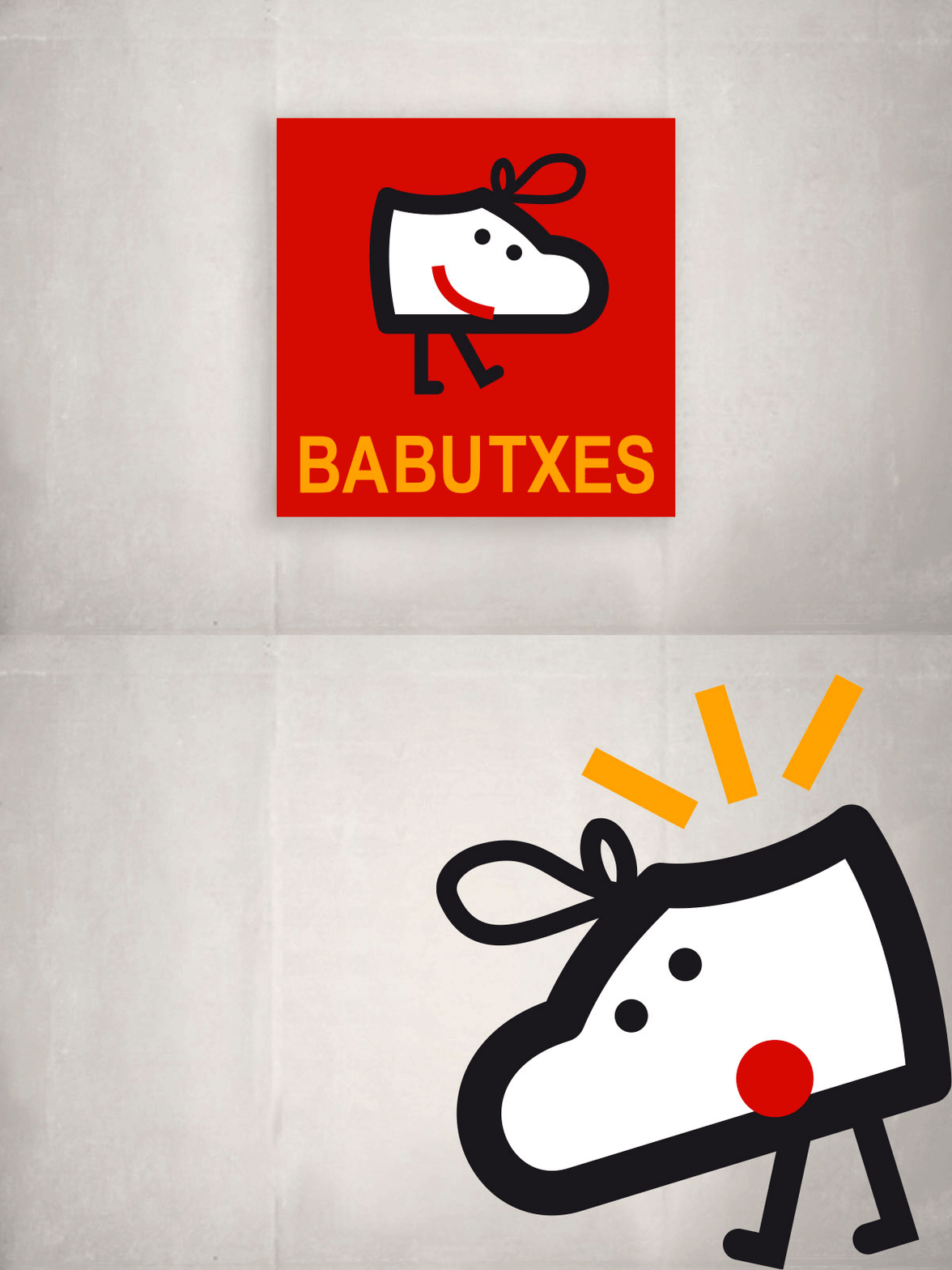
The logo was designed to be clean and recognizable. We chose a modern yet accessible typeface that reflected the product’s quality without being pretentious. The choice of colors was also key: the vibrant red became the protagonist, symbolizing energy, passion, and vitality—values we wanted to associate with the brand.
The Living Symbol of Babutxes
This is where Juan Prieto's talent truly shone. Juan created a dynamic symbol, designed to adapt to different environments and situations. We didn’t want a static logo; we wanted Babutxes to have a living identity, capable of evolving and resonating in different contexts.
The Babutxes symbol is meant to be versatile. It can appear in its full form on the store’s facade or in a simplified version on social media and other digital platforms. This flexibility allows the brand to remain consistent, no matter the format in which it’s presented.
The Importance of Outdoor Advertising
For a physical store, outdoor advertising is fundamental. From the very beginning, we understood that the exterior signage of Babutxes would be one of the first points of contact with the public. We designed a storefront that was not only attractive but also functional and visible from a distance.
The use of vibrant red in the signage helped capture the attention of passersby, inviting them to come in and discover the store. The arrangement of visual elements was carefully planned to ensure the brand was easily recognizable.
The Red Bags: A Key Element in the Strategy
One of the most interesting aspects of this project was the design of the shopping bags. We knew that the bags weren’t just a means to carry the shoes but also an opportunity for mobile advertising. That’s why the bag design was a crucial factor in the branding strategy.
We opted for bags in a striking red, with the Babutxes logo in white to create a bold visual contrast. The simple yet bold design made the bags easily recognizable around the city. Every customer who left the store became a brand ambassador, carrying the red bags through the streets and increasing Babutxes' visibility.
This approach not only helped strengthen the store’s identity but also created a sense of belonging among customers. Carrying a Babutxes bag wasn’t just an act of shopping; it was also a statement of style and good taste.
Connecting with the Audience: The Essence of Babutxes
From the start, our goal was to create a brand that emotionally connected with the audience. We wanted Babutxes to be synonymous not just with quality but also with closeness and trust. This was reflected not only in the visual design but also in how the store interacted with its customers.
Customer service, product quality, and brand consistency created an experience that went beyond just buying shoes. Babutxes became a place where people felt welcomed, valued, and understood.
Working on the creation of the Babutxes brand alongside Juan Prieto was an incredibly rewarding experience. This project allowed us to explore how a brand can be simple yet powerful, approachable yet sophisticated. From the exterior signage to the bag design, every detail was crafted to create an identity that resonated with the audience and left a lasting impression.
At ElefantAmbulant, I will continue sharing projects like this, where creativity and strategy come together to build brands that don’t just sell products but also tell stories.
If you have a project in mind or need branding advice, don’t hesitate to get in touch with me. At ElefantAmbulant, we are always ready to help bring your brand to life.
Until the next post,
Tito Estruch
Interim Manager in Communication | Expert in Marketing and Brand Creation
