
News
Creating Identity: The Institutional Brand of the Ajuntament de Palma de Gandia
- 03/02/2025
- What I like
Today, I want to share with you an experience that challenged me both professionally and creatively: the design of the institutional brand for the Ajuntament de Palma de Gandia. This project was not only an opportunity to modernize the image of a public institution but also an exercise in adaptation and creativity in the face of limited initial information.
The Challenge of Starting from Almost Nothing
When I was contacted to work on the identity of the Ajuntament de Palma de Gandia, I encountered an unusual situation: there was practically no prior information. There were no clear guidelines, nor an extensive historical archive to guide the redesign. The absence of references was a challenge, but it also opened the door to creating from a fresh and contemporary perspective.
These types of projects require deep research. Without a solid foundation, I decided to immerse myself in the history and culture of Palma de Gandia, exploring its roots, local symbols, and the emotional connection that residents have with their municipality. My goal was clear: to create a brand that not only represented the institution but also reflected the community’s pride.
Modernity as a Fundamental Pillar
One of the key premises of the project was to provide the Ajuntament with an image that reflected modernity and dynamism. Public institutions often carry traditional aesthetics that, while respecting history, often fail to connect with younger generations and new forms of digital communication.
For Palma de Gandia, modernity did not mean breaking with the past but rather evolving with it. The idea was to maintain the essence of the traditional coat of arms but with a cleaner, minimalist approach that could adapt to various formats, from official stationery to social media and digital platforms.
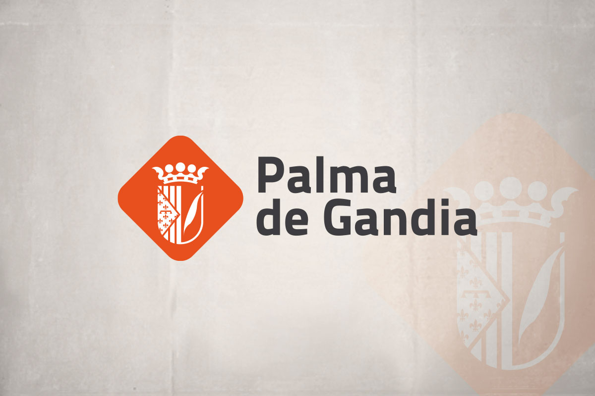
The Color Orange: A Tribute to La Safor
One of the most distinctive elements of this brand is the use of the color orange. The choice was not random. The region of La Safor, where Palma de Gandia is located, is known for its citrus production, with oranges being the quintessential fruit. This crop is not only a part of the local economy but also a cultural and emotional symbol for its inhabitants.
Incorporating orange into the institutional brand was a way to highlight this regional identity. The color brings warmth, energy, and vitality, characteristics we wanted to convey in the new image of the Ajuntament. Additionally, orange contrasts perfectly with other visual elements, ensuring visibility and immediate recognition.
Clean Design and Legibility: Keys to Modern Design
Another fundamental aspect of the brand’s development was ensuring clean design and legibility. Public institutions need a clear image that can be easily understood by all citizens, regardless of the medium in which it is used.
The redesign of the Palma de Gandia coat of arms focused on simplifying shapes and lines, removing unnecessary elements without losing the essence and symbolism that represent the municipality’s history. This simplification not only improves aesthetics but also facilitates its application across different mediums, from printed documents to digital applications.
The chosen typography plays a crucial role in legibility. We opted for a modern yet sober font that reflected the institution’s seriousness without sacrificing a contemporary touch. The combination of typography with the visual symbol creates a coherent and solid identity capable of enduring over time.
The Creative Process: From Idea to Reality
The process of creating the institutional brand for the Ajuntament de Palma de Gandia was a journey full of exploration and discovery. Without a defined guide at the beginning, each step of the project became an opportunity to innovate and experiment.
-
Research and Analysis: I started by studying the history of Palma de Gandia, its traditions, and its most representative symbols. I also analyzed how other institutions had approached similar processes of modernizing their image.
-
Sketches and Proposals: With the information gathered, I began working on several sketches. The challenge was to find the perfect balance between tradition and modernity. I presented different proposals, each with variations in color usage, coat of arms simplification, and typography.
-
Feedback and Adjustments: Collaboration with the Ajuntament’s team was key. Through several rounds of feedback, we refined the designs until we found the version that best represented the essence of Palma de Gandia.
-
Implementation: Once the final brand was approved, we worked on its implementation across different platforms: official stationery, urban signage, digital platforms, among others. The design’s adaptability was crucial to ensure visual coherence across all channels.
A Symbol That Connects Past and Future
The final result is a brand that connects the past and future of Palma de Gandia. We managed to create an identity that respects the municipality’s tradition while looking forward, with a modern and relevant image for the present.
The color orange not only honors La Safor’s agricultural wealth but also symbolizes the energy and vitality of a community in constant evolution. The clean design and legibility ensure that this brand can be effectively used in any context, guaranteeing that the Ajuntament de Palma de Gandia has a strong and coherent presence in all its activities.
Working on the institutional brand of the Ajuntament de Palma de Gandia was an enriching experience that allowed me to apply my knowledge in branding and corporate identity in a challenging context. The lack of initial information turned into an opportunity to reinvent the institutional image in a creative and meaningful way.
Through this blog, I will continue to share stories like this, exploring how design and communication can transform the perception of institutions and emotionally connect with communities.
If you have a project in mind or need advice on branding, don’t hesitate to contact me. At ElefantAmbulant, we are always ready to help bring your brand to life.
Until the next post,
Tito Estruch
Interim Manager in Communication | Expert in Marketing and Brand Creation